
Here at Basis Points Technology, we seek out opportunities to enrich our learning even if the work strays from actual work. In this case, we employed our passion for soccer (football) to devise a fun way of visualizing data. (Football remains in our minds even though sports organizations rightfully suspended activities due to the Coronavirus pandemic.)
We created a business intelligence report that takes a closer look at performance data for a mixture of 16 active and inactive midfielders. Ultimately, we used this performance data to derive what we call their “Net Total Output per Game” percentage (NOPG%). This field value, and all other data points in the report, only reflect a player’s total domestic career (club-level) and not their international caps).
Just as a side note, loyalty permeating throughout The Beautiful Game compel us to lay down some groundwork about this report. We encourage you to review the points that appear in the appendix at the end of this post.
The Report
In our sample business intelligence report, we gleaned each player’s total domestic game statistics from transfermarkt.com. From these numbers, we constructed a productivity comparison of past and current “top-level” midfielders whose goals, assists, and disciplinary activity measure productivity.
Using their total appearances, goals, and assists tally, we created calculated fields in DAX to derive each player’s goals, assists, and average total output per game percentages. The report’s data table also shows the averages of the entire sample at the bottom of the table, which allows you to review an individual player’s numbers and how it compares to the collective average.
The Challenge
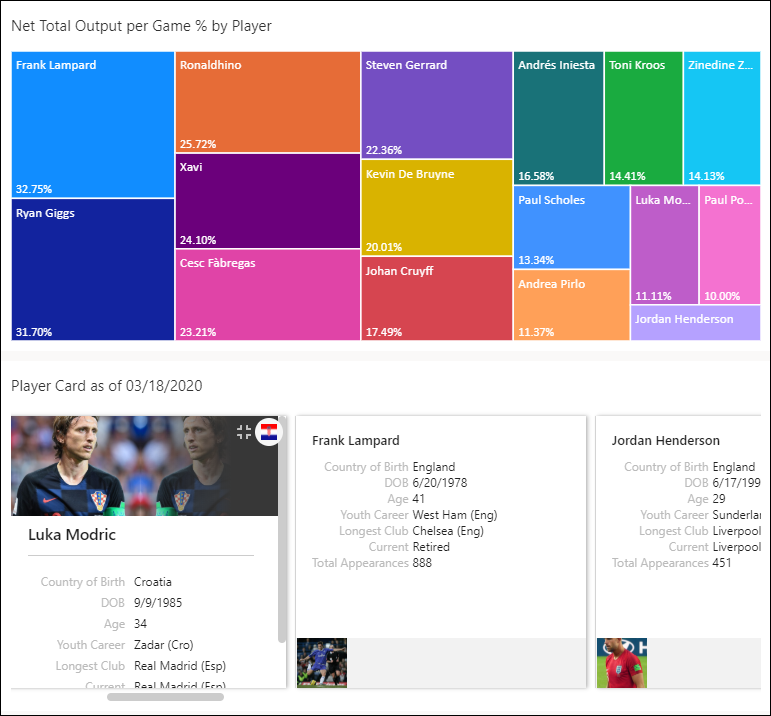
What we initially thought would be an easy report to build became painstakingly tedious on a few fronts. The first obstacle lied within the overall story that we wanted our report to convey as illustrated below.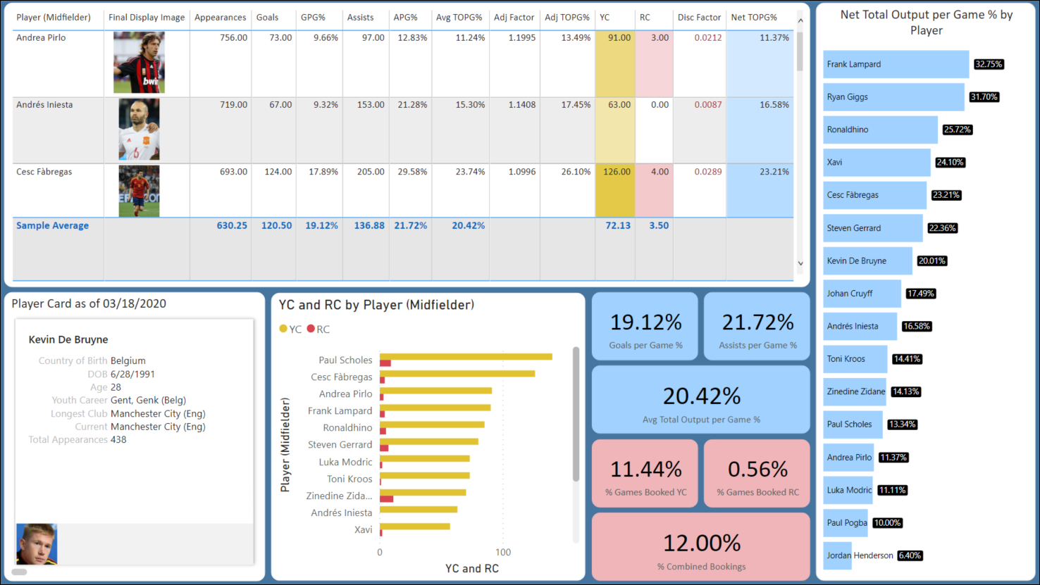
For example, we disliked how our “Net Total Output” visual took up the entire righthand side of the report. We also thought that the yellow/red card visual (bottom-middle) reflected redundancy and was largely irrelevant. And lastly, the blue and light red percentage value bubbles, while visually cute, ineffectively communicated important aspects of the report.
However, building a cohesive story in our report paled in comparison to the challenges we faced bringing in player pictures. As you can see, the report is displaying player images in a data table and separately in a card visual. But even though they are the same pictures, they use completely different logic to display them. We will discuss this in more detail in the following section.
The Result (Part 1) – Storytelling
Frankly, we struggled with the report’s messaging until it finally dawned on us to keep it simple, stupid. From an earlier iteration, we replaced the “Net Total Output” visual as a condensed treemap, which also brought some welcome vibrancy. The treemap also displayed every player into a single view while maintaining the hierarchy of the original visual.
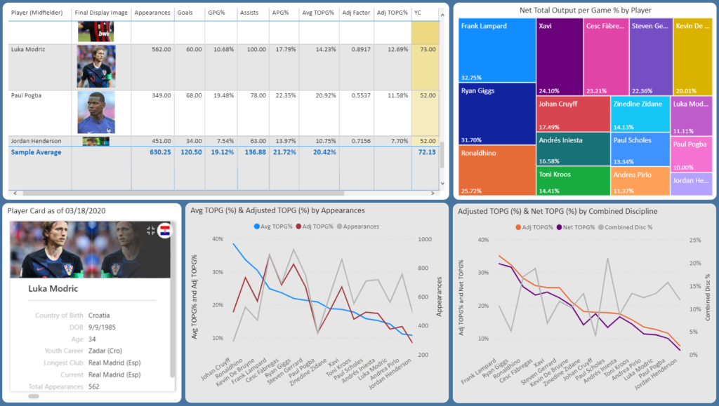
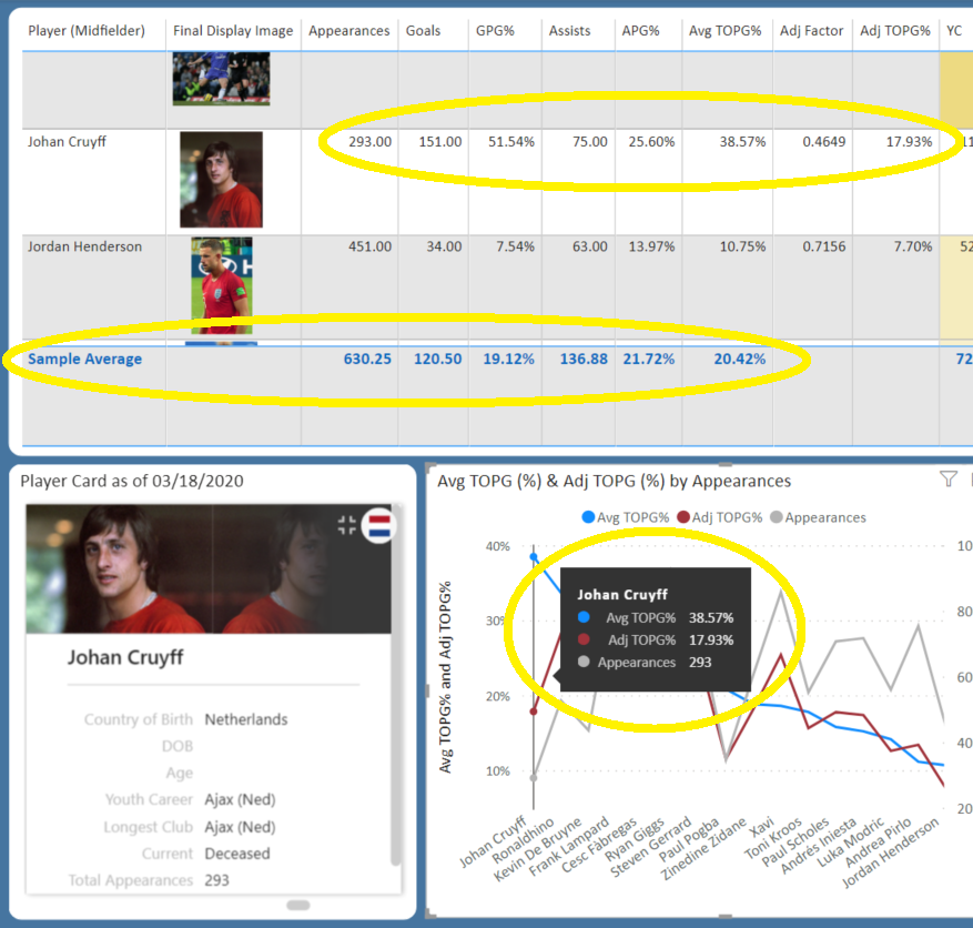
For the clunky blue and red bubbles, we replaced them with line charts to clearly communicate the data field associations. So in the first line chart, we show the adjustment to account for the difference in total appearances per player. Johan Cruyff made 293 total domestic appearances and generated an impressive goal/assist tally while doing so (see below). But it did not seem fair to compare Cruyff’s productivity to Manchester United’s, Ryan Giggs, who amassed 927 total appearances.
We used a similar process for the second line chart, but applied a disciplinary factor that subtracted from a player’s net output. The effect of yellow and red cards factor in as they can be significant during games and throughout a player’s season. Look no further at Paul Scholes (see below) whose combined disciplinary action was double the sampling average.

The Result (Part 2) – Getting Images to Work
Regarding the player images in the report, you would be fine if you kept associated field elements simple. For instance, the player card displayed on the bottom left of the illustration above is a simple image URL call. But if you clicked on different players in the card it would adversely affect field calculations in other report areas. This prompted us to switch off the card’s interactions with the other modules.
When calling image URLs inside the table, this also adversely affected calculated data fields inside and outside of the table. After coming close to giving up, we finally found a suitable workaround (because not having player images in our report was no longer an option).
Our online research recommended storing images locally and create Power Query functions to optimize the efficiency of the calls. The functions work as follows:
(a) Encodes images as storable text values
(b) Split the encoded text values into separate and smaller-sized fields in Power BI
(c) Index these individual fields to optimize data retrieval every time a call is made to them from the report table
Ultimately, we think the persistence paid off in the form of a cleaner and more visually attractive report. And we managed to learn some essential aspects of effective storytelling with business intelligence.
Appendix – Source Data, Process, and Player Selection
We used Transfermarkt.com as our statistical data source and Wikipedia as the biographical source for the player profiles. The raw data points used to measure each player’s productivity are: total domestic appearances, goals, assists, and disciplinary activity (yellow and red cards).
We wanted to include additional “productivity” fields but found it near impossible based on availability and the varying player timelines. E.g. fields such as ExpG/xG and “passes completed percentages” are relatively young collected data points in football. There are little to no reliable sources for the complete player history for these fields (particularly for the older player profiles).
The raw or derived report numbers are not a conclusive reflection of the best midfield player out of the sampling. So for example, Andrea Pirlo’s numbers do not reflect his deserved reputation as one of the most influential players of his generation.
The sampling also does not insuniate that the players are like-for-like midfielders. The sampling covers a mixture of attacking, defensive, box-to-box, and playmaker styles.
The players in this report are purely a subjective observation of influential/high-performing midfielders throughout the recent history of football. Please do not take any offense if your favorite players are not showcased here.
Lastly, our inclusion of Brazilian player, Ronaldhino, arguably sticks out as an outlier when compared to the other players. Teams deployed Ronaldhino interchangeably as a forward and attacking midfielder. However, we wanted to showcase his prowess as both an executor and assistant of goals compared to the sampling average.
Get in Touch!
![]()
If you want to explore how Basis Points Technology can assist you with your business intelligence reporting needs, navigate to our contact form or email us at info@basispointstech.com.