
The Report
Not to jump on the coronavirus dashboard/reporting bandwagon, but we have been tinkering with a Covid-19 dashboard of our own. We wanted to drill into state levels a little further to monitor the scope and our collective progress towards combating the pandemic in our own backyard.
For the source data, we established API calls to the Covid Tracking Project website (see illustration below), which we then cleaned up in Power BI’s query editor functionality to build our report tables.

The illustration above also shows that we created an API call to census.gov website where you would need to request your own API key before you would be able to pull data from them. (We are still determining how best to use the data that comes from this API call.)
Some data source sites require your own unique API key and some do not — like in the case here with the general API calls from the Covid Tracking Project versus the census one requiring a key.
The Challenge
We did not face any major challenges with building the actual report other than trying to determine the UX and overall presentation of it. Otherwise, we spent a little more time getting familiar with Power BI’s Python visualization feature and testing/implementing the auto-refresh functionality in the web version of Power BI.
Integrating with Python
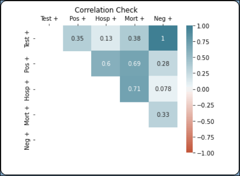
We created a statistical correlation visual through the Python feature so that we can understand the numeral correlation between specific fields in the source data. Generally, a correlation that is 70% (.70) or higher indicates a strong correlation.
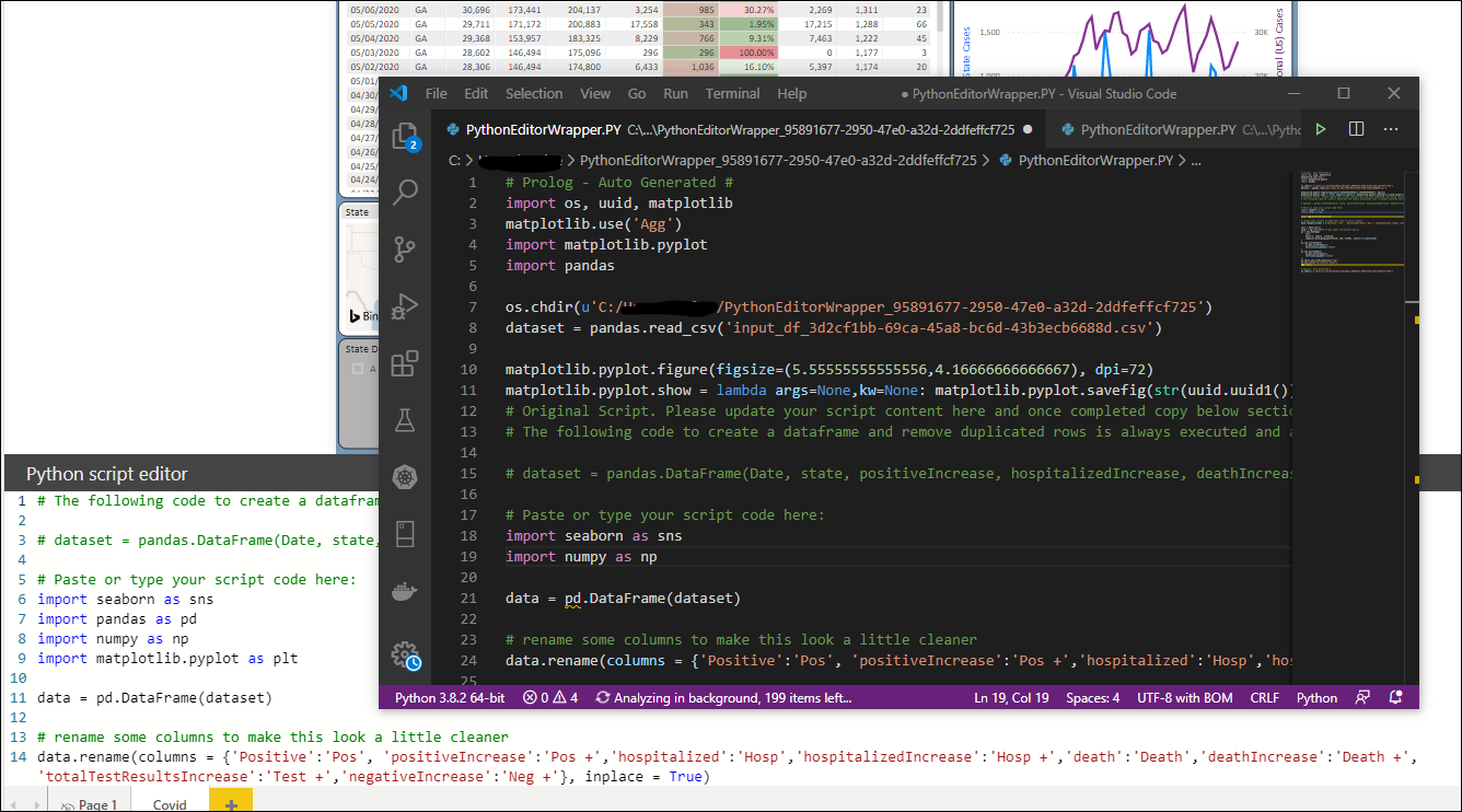
Microsoft Power BI’s Python visualization comes with its own script editor, but it also allows you to interact with your own integrated development environment (IDE) if you need something more robust for your coding purposes (see below).
Scheduling an Auto-Refresh for a Report
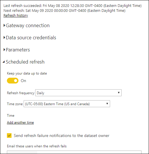
We implemented Power BI’s “Scheduled Refresh” feature that you can only configure inside the web version of the application as illustrated below. This functionality interacts with the API calls directly, so there is nothing left for you to do on a daily basis other than to view the report. But if you are impatient as we are at times, you still have the ability to commit “on demand” source data refreshes within both the desktop and web version of the application.
The Result
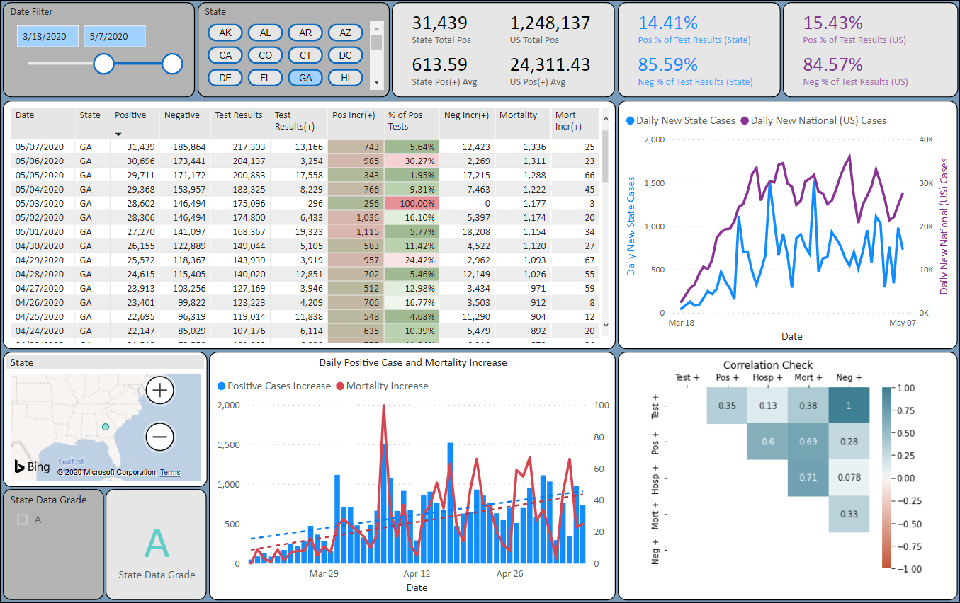
So what is the report telling us?
If you take a look at the state of New York and expand the report table, we applied conditional formatting to the daily confirmed cases (Pos Incr(+)) and percentage of positive tests (% of Pos Tests) columns to visually track progress.
This green-red column formatting gives us an immediate sense of the arc of confirmed coronavirus cases for the state of New York where the percentage peak of daily positive test results spanned from late March to mid April. The “Daily Positive Cases and Mortality Increase” column chart to the right of the table provides a more graphical representation of this arc.
For this selected time period (mid March to first week of May), we are showing a strong correlation (.79) between the increase of people who tested positive for coronavirus and the increase of people being hospitalized for it.
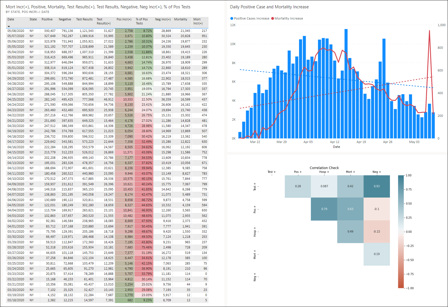
However, if we hone in on the time period where confirmed cases in New York were aggressively rising (early to mid March) to its peak period (mid April), you would start seeing very strong correlations across the board for all areas.
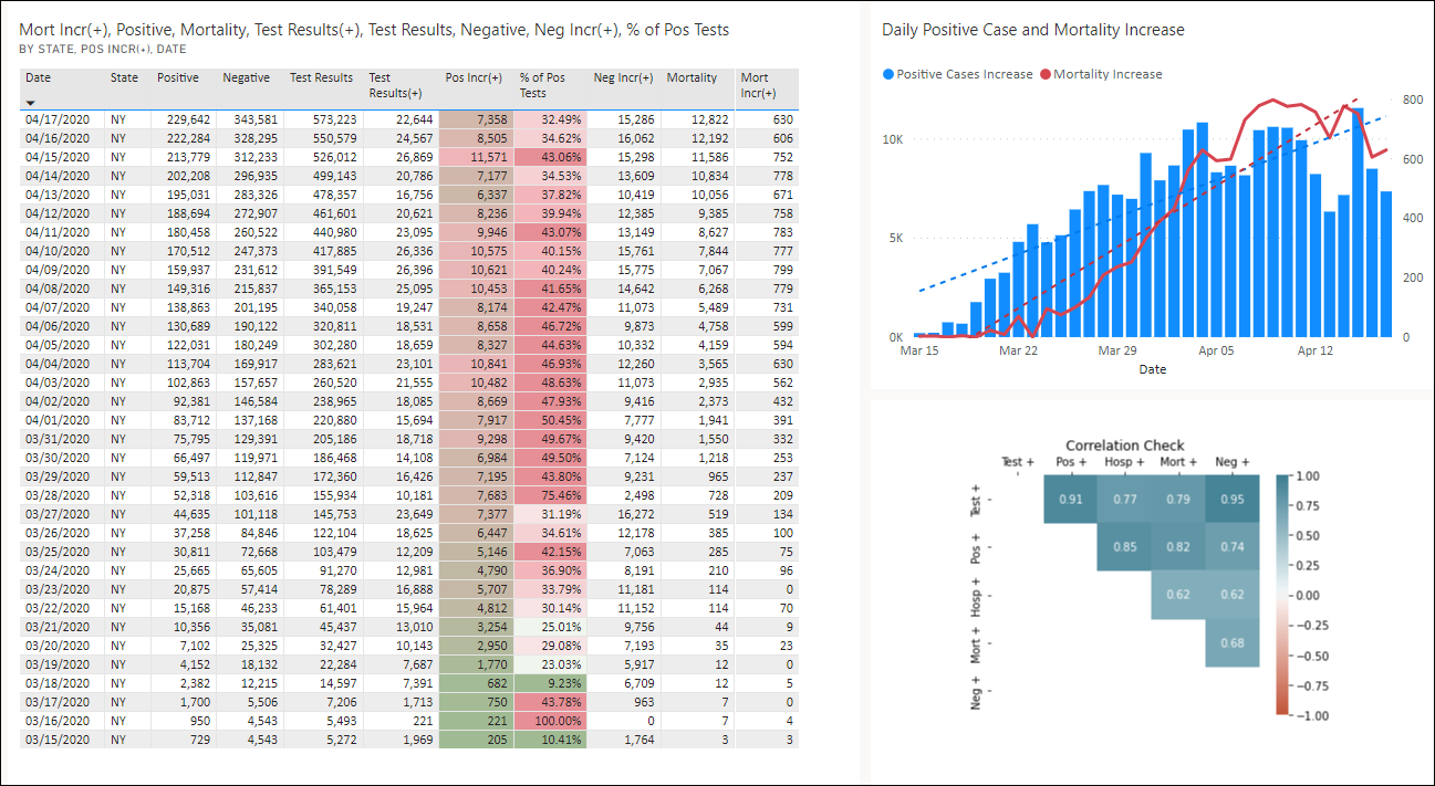
The Correlation of “Daily Test Increases” to:
Positive Results Increase (.91)
Hospitalization Increase (.77)
Mortality Increase (.79)
The Correlation of “Positive Test Results Increase” to:
Hospitalization Increase (.85)
Mortality Increase (.82)
Basically, the data does not exaggerate. If you have been paying attention to the news on a daily basis then you are aware of how the current pandemic has been affecting the state of New York.
Conclusion
Placing a BI report on “auto-pilot” once it has been created and deployed using Power BI’s scheduling feature adds a lot of convenience to your daily reporting. And we will continue to explore the ways on how we can put our Python-coding skills to use as our understanding of the language grows by each day.
Taking advantage of data calls via APIs proves to be an easy and efficient method to establish an immediate and ongoing data source for your reporting needs. External APIs do leave you at the mercy of their owners in case they are altered or removed entirely, but the low maintenance trade off may qualify it as a worthwhile option to explore for your organization.
Get in Touch!
![]()
If you want to explore how Basis Points Technology can assist you with your Business Intelligence reporting needs, navigate to our contact form or email us at info@basispointstech.com.